I’ve been fortunate enough to have been commissioned to design and make a number of furniture pieces in the Biedermeier style. This is somewhat unusual in that my studio is located in the Midwest (of the North American continent). The one style that has been consistently popular in this region has been Arts & Crafts. It’s always pleasant to explore styles of other periods and regions.
The Biedermeier style evolved from the economic and political changes that swept Europe in the first half of the 19th century. Often thought of as a response to the French Empire style it has been characterized as resulting from the growth of the bourgeoisie in German speaking regions of Europe after the defeat of Napoleon at Waterloo in 1815. As with many efforts to shake off the old and make a change some of the furniture that emerged from this era was awkward and clunky.
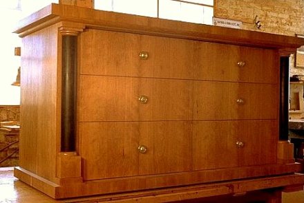
As a designer and craftsperson I sought to avoid the poorly proportioned and unbalanced look and try and discover elements of the Biedermeier style that were graceful. One of the first that struck me when studying Biedermeier furniture was the use of veneers in a way that tied a piece, particularly cabinetry, together into a unified whole. It is sometimes called a waterfall affect in which the grain is matched through all elements of a face and around onto the top. A detail from a piece I created can show this march of the grain.

I added red arrows to help illustrate this affect. You may be able to see it as well in this full image of the piece.

Even though the various parts and sections of the casework were not all aligned onto the same frontal plane, as if projected onto a flat screen, the use of the veneer grain contributed to what I see as a very modern look. It has a look as if the parts were punched out of one sheet of material and then folded around to create a three dimensional case. I also sometimes see it as if pigment was poured over the piece and allowed to drip down the front. Because it is the natural grain it is very naturalistic and at the same time very graphic. Perhaps this is why I often think of the Biedermeier style as a transitional style. It is by no means at a dead end. It is pointing to modernism.
By the way, it is not altogther clear where the term Biedermeier comes from. Joseph Aronson in his “Encylopedia of Furniture” from Crown Publishers 1965 says “[t]he name derives from a comic-paper character, Papa Biedermeier, symbol of homely substantial comfort and well-being –Gemutlichkeit.” And Hakan Groth says, “The term ‘Biedermeier’ is often wrongly assumed to be the name of a cabinetmaker or designer of the period. During the late 1840s in Austria and Germany, the preceding era (1815-1847) was subject to a barrage of satire, which finally led to the very furniture being mocked.” I have also seen reference to a fictional, comic poet named Biedermeier. It is clear however that this style did veer into regions that were easily mocked. Without jumping into an extended discussion about absolute values of design I will say that I wanted to work with the elements of Biedermeier style that could be brought together with a sense of proportion, balance and grace.
At the time I was exploring Biedermeier design I was doing almost all of my design work on paper in pencil and sometimes watercolor and colored pencil. Here is drawing of a chair I designed followed by a picture of the final piece.


In as much as the Biedermeier style was a reaction to the much more, perhaps, pompous Empire style it used a very similar vocabulary. It was far from revolutionary. It sought to adjust and perhaps contain some of the excesses the emerging bourgeoisie felt were beyond the pale. Among some of the elements that were retained and sometimes re-interpreted was the use of black to contrast with the grain of the fruit woods commonly used. Gone were the gold and the gilt however, except perhaps as discreet functional accents such as pulls. Another element retained was the column, that reference to Roman dominance and power. The Roman column was also and quite likely even more a symbol of stability. And it was in the use of the column that I was able to start to work out the proportions that I would use. For the columns used in western European design derive from the classical orders of Greek and Roman architecture.
There is a great reference book that I use quite a lot, “Cabinet Making and Millwork, Tools Materials Layout Construction” by Alf Dahl (who at the time was Head of the Building Trades Department of the Los Angeles Trade-Technical Junior College) and J. Douglas Wilson (who at one time was the curriculum supervisor for Trades and Industries at the Los Angeles City Schools), originally published in 1953 by the American Technical Society. In just over 300 pages this classic comprehensively covers and amazing amount of material. I may do a post just about this one book one day. For now I want to introduce two illustrations found in the book that show the classical orders and how proportions for various elements are derived from the diameter (D in the figures) of the column.


There are many ways to approach proportion and balance in design. Using the classical orders seemed appropriate historically when designing Biedermeier style furniture although it wasn’t always practical. All of this work was custom design work and as such I had to take into account the view of two clients in this case, the interior designer I was working with and the end user client. Sometimes I had to adjust proportions to meet the functional needs of my clients. I always try to do this adjustment within some coherent framework. In some cases I work with the proportions ascribed by the Golden Mean and have found that much of the architecture derived from the classical orders also relates to the proportions derived from the Golden Mean. Much has been written about the Golden Mean. All I will do here is draw your attention to a very interesting book on the subject by Gyorgy Doczi, “The Power of Limits, Proportional Harmonies in Nature, Art & Architecture” published in 1981 by Shambala press.
Here is a study I did for a proposed design for the desk pictured above.

The proposed column design is drawn horizontally across the top, many of the other proportions were derived from this element.
Another piece from this series was this large armoire, the base is shown at the top of this post.

The bedroom set was completed by two night stands and a bed.


This is a detail of the column base for the bed.
Another project that was related to the Biedermeier style of furniture I was fortunate to work on was a dining table I designed and made to go with a set of antique Biedermeier chairs a client had purchased. The interior designer I worked with on this project and the client had seen a table that they wanted to go with the chairs. The table had a solid top and they were looking for a glass top so they approached me. They gave me a small clipping of a small section of the carved legs that they particularly liked of the original table. I was able to create a table that was carved on both sides of the rails so that when one viewed the rails and legs through the glass top the whole piece looked finished. The table was then finished by Catherine Lottes using stains, glazes and gold leaf. Below are some images of the carved table base before and after the finish was applied.


The challenges I’ve found when working in a wide variety of styles are part of the reason I love this work so much. You may have noticed that the style of work I’ve shown in his post is not very close to a lot of my other work. Nevertheless I find it fascinating that in being a craftsperson and working in other styles in which you have to actually create a real object or set of objects in the real world you have an opportunity to unwrap layers of history and thought. You are uncovering the same practical and aesthetic problems others, sometimes long ago, have worked on. Through your hands you can touch the ideas of others.

 ::
::  ::
::  ::
::  ::
::  ::
::  ::
::  ::
::  ::
::  ::
::  ::
::  ::
:: 

You have influenced my thoughts because I find truth in what you say so I respect, contemplate and elaborate on what you share. I don’t know if ever you will recognize your influence on my work, but it is there.
Kim,
You are most generous and kind to me and I feel that you have given me a great compliment by saying I have had some influence on your work.
BTW, I have clay, it is calling to me thanks to you. 😉
Hi Todd, here I’m again (from woodenboat forum). Just to say that Biedermeier means – if you don’t know – “Bieder Meier”, i.e. “the affable Meier”. Since Meier is one of the most common German name, “Herr Meier” represents the typical German person, like “signor Rossi” the typical Italian and “Mr Smith” the typical American/English one. Biedermeier is the style of the German middle-class person, affable, loving the peace of his home, etc. It could be translated as “the affable Mr. Smith”, obviously with all the merits and the lacks of the middle class in Europe after the Napoleon era. ‘bye from Italy, see you at woodenboat
Antonio,
Thanks for dropping in.
See you over at woodenboat.
Todd
Pingback: Biedermeier | Access Decorati
Pingback: Biedermeier Art Furniture | Whose Home
Pingback: Designing a Chair | Fillingham Art Furniture Design