Designing a Chair

I often work with interior designers. Recently one that I’ve worked with for many years asked that I think about a design for a client that had  pretty specific requirements for a chair. The client recently having moved into a new condo had a walnut desk of Mid-Century vintage in her new bedroom that needed a chair. The new chair needed to have a look that would fit the design of the desk; it also had to fit the client so that she could sit comfortably at the desk, her stature being somewhat smaller than most chairs are designed for. The chair also had to slide in under the desk when not in use.

I visited the site and took this picture of the desk.

The interior designer remembered a chair that I had done for another client of her’s some time ago and thought that something similar might work in this case although the style would have to be changed to a Mid-Century Modern look.

This chair was designed to look like a Biedermeier chair for a bedroom set I had done in that style. I took this basic chair, changed the dimensions to the ones we had worked out with the client to get the seat height just right and created this first design.

You can see how I took the design detail of the pulls from the desk and put it in the back. Here is a drawing of the dimensions that I gave to the client along with several renderings like the one above.

The client didn’t think that this was what she was looking for so it was literally back to the drawing board for me. I realized that the client had the sense that the chair wasn’t sturdy enough and didn’t offer enough support. That led me to create this next design.

And below you can see the added lumbar support this design offered.

I also created this front view of the design…

…and a line drawing with dimensions.

The client said that this was perfect.

Here is the final product.

A word about the finish I used. Typically the walnut used in Mid Century Modern furniture made before the 1980’s had a lighter color than walnut available today. This is partly due to the interest in darker woods towards the end of the 20th century. It has also become much harder to find walnut logs of the size available before the 80’s with their wide expanses of heartwood. Consequently it became standard for sawyers to treat walnut with steam in the process of drying it. This darkened both the heartwood but also the lighter colored sapwood, giving them more sale-able wood.

I selected the wood for this chair by color and grain pattern. To achieve as light a finish as possible I devised a finish that used several coats of different shellacs top-coated with a mixture of linseed oil and spar varnish. The client said she was very pleased with the chair and finish.

Salad Tongs (great wedding gift!)

Cherry Salad Tongs

I found the inspiration for these salad tongs while perusing old magazines. They are a perfect way to use pieces of cherry veneer that are too small for tables and cabinets. They are finished with a light coat of a food safe oil. All they need after tossing your salad is a gentle wipe with a damp cloth. Your salad oil will further enhance the finish. These are not dishwasher safe. Click on any of the images to go to my Etsy shop where it is easy to place an order.

Oh btw, a set would also make a very nice house warming gift.

A Deck Chair

Modern Patio Furniture

Deck Chair

Purchase on Etsy

Summer is here and I’ve been thinking about relaxing on my deck, simply watching the world go by. Why not create a really nice patio chair for doing just that? Something inspired by wooden boats,  something reminiscent of Mid Century Modern or Danish Modern design. Something that can take a little weather if it’s left out for the weekend. The more I thought about it the more I started noticing that there are an awful lot of smaller sized balconies attached to some really nice condo units that could use a couple of really nice patio chairs too. If you’ve found my other blog you may know that I’ve been watching the new condos, especially those along the rivers in Milwaukee, pretty closely. (The picture links to that blog if you’re curious.) So, I designed this chair. It’s a little smaller than a lot of outdoor chairs out there so that a couple of them will easily fit on a condo balcony, yet it is very comfortable for even big guys like me.by Todd Fillingham I made the first two out of walnut, which turns out to be very durable wood for outdoor use (used in boat building worldwide), northern white cedar (another boat wood) and stainless steel. The back is easily removed (no tools needed) for shipping and storage . I finished the chair with my own mix of oils and spar varnish.  This is an easy chair, made for sitting back and relaxing, part of what I call my summer stress relief system.  Set it out and sit back. by Todd Fillingham

by Todd Fillingham

by Todd Fillingham Where can you get these? Two are now available on my Etsy site where it is very easy to order online.   I’ll deliver them  in the metro Milwaukee area with no shipping charge. Enjoy the summer!

By the way, I will be recommending on my Etsy site that these chairs be used in a protected outdoor setting however you can leave these chairs out in the weather all summer if you want. The finish may fade some. If it fades too much it can easily be restored, or better yet the chair can simply weather to a beautiful, stylish gray, it will still be just as comfortable. All metal parts are stainless steel so they won’t rust and the woods are highly resistant to rot.

Please feel free to leave a comment here to contact me. Or, if you would prefer you are welcome to use my alternate email address which is tfilling@execpc.com . I am also available on twitter as @toddfi .

buy now

Update: I’ve been asked for the dimensions of this chair. Here they are:

deck chair by Todd Fillingham all rights reserved


Color and Form: paint on furniture

Designing furniture that includes painted surfaces offers opportunities work with color, painted forms and the sculptural shapes of the piece itself. The image above is a detail from a cabinet I made that my family and I use to hang our coats on and store hats, gloves, mittens and scarves.

Saddle Stool by T. Fillingham

I designed this piece to play with the idea of functional sculpture and 2D art. I call it a saddle stool. It may be sat on like a saddle facing the front painted surface or as a more normal stool.

It was never intended to be very practical seating, more to encourage a reaction to the expression of abstracted eroticism.

I’ve used this form, the shape of the painted surface in the stool above, many times.

_______________________________________________________________

.

Oval Top Table by T. Fillingham

.

Oval Top Table by T. Fillinghan

2 Oval Top Tables by T. Fillingham

I did a series of low, side tables with etched glass tops. Below are 4 of them with one of the tops. By using the glass I added another layer for exploring painted forms by creating clear windows through which some of the painted surface could clearly be seen while the translucent surface of the glass created an implied surface beneath it.

A series of small table bases by T. Fillingham

At some point I became interested in a more literal interpretation of colors and forms and created a series of fish tables. At the time I had 2 assistants working for me in my studio and I challenged them to develop painted designs based on my input. We visited a nearby store that had huge aquariums as well as studied tropical fish coloring from reference material. I carved the shapes and legs and worked with my assistants in developing the palette for each table, they did the painting. Here are a few of the tables we produced.

Collaborative Work from the Studio of T. Fillingham

This next piece is not exactly furniture, but it does show my interest in painted, sculptural forms that have roots in pragmatic objects. This is my canoe form.

This last piece was commissioned by a couple that had received this large copper pan as a gift while traveling in Africa. It had been used to roast cocoa beans over an open fire. They wanted to display it and use it in their home to hold magazines. I suggested attempting to indicate a sense of ritual. The couple were on their honeymoon when they received the pan. I researched some of the art of the traditional cultures from the region they had traveled in and used motifs of form and color to create the stand.

And here we get at something that I find fascinating. Traditional cultures around the world have expressed myth and culture by creating objects of color and form for a very long time. Even though I explore many forms of abstraction and am inspired my a great deal of modern art in this, the use of painted forms on 3D forms I feel part of an almost eternal tradition.

Biedermeier

Armoire base by Todd Fillingham

I’ve been fortunate enough to have been commissioned to design and make a number of furniture pieces in the Biedermeier style. This is somewhat unusual in that my studio is located in the Midwest (of the North American continent). The one style that has been consistently popular in this region has been Arts & Crafts. It’s always pleasant to explore styles of other periods and regions.

The Biedermeier style evolved from the economic and political changes that swept Europe in the first half of the 19th century. Often thought of as a response to the French Empire style it has been characterized as resulting from the growth of the bourgeoisie in German speaking regions of Europe after the defeat of Napoleon at Waterloo in 1815. As with many efforts to shake off the old and make a change some of the furniture that emerged from this era was awkward and clunky.

As a designer and craftsperson I sought to avoid the poorly proportioned and unbalanced look and try and discover elements of the Biedermeier style that were graceful. One of the first that struck me when studying Biedermeier furniture was the use of veneers in a way that tied a piece, particularly cabinetry, together into a unified whole. It is sometimes called a waterfall affect in which the grain is matched through all elements of a face and around onto the top. A detail from a piece I created can show this march of the grain.

I added red arrows to help illustrate this affect. You may be able to see it as well in this full image of the piece.

Even though the various parts and sections of the casework were not all aligned onto the same frontal plane, as if projected onto a flat screen, the use of the veneer grain contributed to what I see as a very modern look. It has a look as if the parts were punched out of one sheet of material and then folded around to create a three dimensional case. I also sometimes see it as if pigment was poured over the piece and allowed to drip down the front. Because it is the natural grain it is very naturalistic and at the same time very graphic. Perhaps this is why I often think of the Biedermeier style as a transitional style. It is by no means at a dead end. It is pointing to modernism.

By the way, it is not altogther clear where the term Biedermeier comes from. Joseph Aronson in his “Encylopedia of Furniture” from Crown Publishers 1965 says “[t]he name derives from a comic-paper character, Papa Biedermeier, symbol of homely substantial comfort and well-being –Gemutlichkeit.” And Hakan Groth says, “The term ‘Biedermeier’ is often wrongly assumed to be the name of a cabinetmaker or designer of the period. During the late 1840s in Austria and Germany, the preceding era (1815-1847) was subject to a barrage of satire, which finally led to the very furniture being mocked.” I have also seen reference to a fictional, comic poet named Biedermeier. It is clear however that this style did veer into regions that were easily mocked. Without jumping into an extended discussion about absolute values of design I will say that I wanted to work with the elements of Biedermeier style that could be brought together with a sense of proportion, balance and grace.

At the time I was exploring Biedermeier design I was doing almost all of my design work on paper in pencil and sometimes watercolor and colored pencil. Here is drawing of a chair I designed followed by a picture of the final piece.

In as much as the Biedermeier style was a reaction to the much more, perhaps, pompous Empire style it used a very similar vocabulary. It was far from revolutionary. It sought to adjust and perhaps contain some of the excesses the emerging bourgeoisie felt were beyond the pale. Among some of the elements that were retained and sometimes re-interpreted was the use of black to contrast with the grain of the fruit woods commonly used. Gone were the gold and the gilt however, except perhaps as discreet functional accents such as pulls. Another element retained was the column, that reference to Roman dominance and power. The Roman column was also and quite likely even more a symbol of stability. And it was in the use of the column that I was able to start to work out the proportions that I would use. For the columns used in western European design derive from the classical orders of Greek and Roman architecture.

There is a great reference book that I use quite a lot, “Cabinet Making and Millwork, Tools Materials Layout Construction” by Alf Dahl (who at the time was Head of the Building Trades Department of the Los Angeles Trade-Technical Junior College) and J. Douglas Wilson (who at one time was the curriculum supervisor for Trades and Industries at the Los Angeles City Schools), originally published in 1953 by the American Technical Society. In just over 300 pages this classic comprehensively covers and amazing amount of material. I may do a post just about this one book one day. For now I want to introduce two illustrations found in the book that show the classical orders and how proportions for various elements are derived from the diameter (D in the figures) of the column.

Click for larger size.

click for larger image

There are many ways to approach proportion and balance in design. Using the classical orders seemed appropriate historically when designing Biedermeier style furniture although it wasn’t always practical. All of this work was custom design work and as such I had to take into account the view of two clients in this case, the interior designer I was working with and the end user client. Sometimes I had to adjust proportions to meet the functional needs of my clients. I always try to do this adjustment within some coherent framework. In some cases I work with the proportions ascribed by the Golden Mean and have found that much of the architecture derived from the classical orders also relates to the proportions derived from the Golden Mean. Much has been written about the Golden Mean. All I will do here is draw your attention to a very interesting book on the subject by Gyorgy Doczi, “The Power of Limits, Proportional Harmonies in Nature, Art & Architecture” published in 1981 by Shambala press.

Here is a study I did for a proposed design for the desk pictured above.

The proposed column design is drawn horizontally across the top, many of the other proportions were derived from this element.

Another piece from this series was this large armoire, the base is shown at the top of this post.

The bedroom set was completed by two night stands and a bed.

This is a detail of the column base for the bed.

Another project that was related to the Biedermeier style of furniture I was fortunate to work on was a dining table I designed and made to go with a set of antique Biedermeier chairs a client had purchased. The interior designer I worked with on this project and the client had seen a table that they wanted to go with the chairs. The table had a solid top and they were looking for a glass top so they approached me. They gave me a small clipping of a small section of the carved legs that they particularly liked of the original table. I was able to create a table that was carved on both sides of the rails so that when one viewed the rails and legs through the glass top the whole piece looked finished. The table was then finished by Catherine Lottes using stains, glazes and gold leaf. Below are some images of the carved table base before and after the finish was applied.

Table carving by Todd Filingham

The challenges I’ve found when working in a wide variety of styles are part of the reason I love this work so much. You may have noticed that the style of work I’ve shown in his post is not very close to a lot of my other work. Nevertheless I find it fascinating that in being a craftsperson and working in other styles in which you have to actually create a real object or set of objects in the real world you have an opportunity to unwrap layers of history and thought. You are uncovering the same practical and aesthetic problems others, sometimes long ago, have worked on. Through your hands you can touch the ideas of others.

add to del.icio.us :: Add to Blinkslist :: add to furl :: Digg it :: add to ma.gnolia :: Stumble It! :: add to simpy :: seed the vine :: :: :: TailRank :: post to facebook

Asian style furniture

Asian vanity by Todd Fillingham

Asian Vanity by Todd Fillingham.

I have often been asked to design a piece of furniture in an antique Asian style. The image above is an example of a vanity I designed and made for a client’s Asian themed powder room. The project came to me as simply a need to have something that would work as a vanity and fit into the theme of the room. I worked with the interior designer who had done the original design of the room. She had already picked out the counter top material, bowl and plumbing fixtures.

It is not unusual for me to be asked to come up with an idea for something that does not already exist in some form. There isn’t much in the way of antique Asian vanities available. It was also necessary to have the vanity fit certain dimensions, it had to fit the copper bowl that was to be used, yet not be too large for the limited space of the vanity.

Here’s the piece with the top, bowl and plumbing fixture.

Asian vanity by Todd Fillingham

Asian Vanity by Todd Fillingham

To create a design I consulted a couple of my favorite reference books for Asian furniture design. This design was derived from an image of a Chinese ice box shown in “Chinese Household Furniture” by George N. Kates, copyrighted 1948. The other book I use frequently is “Japanese Homes and Their Surroundings” by Edward S. Moore, originally published in 1886. My copy is a Dover edition copyrighted 1961.

It is from these books that I have learned about various motifs that are common among much of antique Asian furniture as well as proportions and function.

Kates notes that filled with ice “very large, almost giant, models of this same type were also placed in the apartments of the Summer Palace, as late as the time of the last Empress Dowager, merely to freshen the air when she was in residence.”

A design motif that is characteristic Asian is the “horsehoof” legs of the stand. I would say that the brass bamboo trim also reads as Asian. I fabricated all of the brass work in this piece save the handle.

I designed another piece that used the horsehoof legs as well.

Asian style table by Todd Fillingham

This is a rendering I created as part of the design process for this project, which was to be a table to hold a piece of carved jade. The line drawing may show the horsehoof elements a little better.

Asian style table by Todd Fillingham

This project eventually took a turn to another style and here is a rendering of the piece I eventually made for the client.

Table by Todd Fillingham

One of earliest projects that was influenced by Asian styles was a room divider screen I designed for clients for whom my partner in Woodcrafter’s Remodeling at the time and I were remodeling a condo unit for. We had installed a pair of skylights and they wanted a screen to block the glare of the afternoon, summer sun. I dug up an old slide of it and used my new and improved slide scanner (more on that later) to digitize it.

Japanese style screen by Todd Fillingham

This reminds me that I have also done several shoji style doors over the years. I’ll have to dig back into my archives to find some images of those for a later post.

This screen was an example of designing and making a piece that was to function as an original, antique piece may have. As I mentioned above, I am often asked to create a piece that will a decidedly more contemporary function. Another project along those lines was a set of bookcases I created. The client wanted antique Asian style bookcases, but there are really none available. She was an informed and avid collector of antique Asian furniture. I had repaired an antique table for her so I was asked to create the bookcases.

I chose to create the “antique Asian” style by using the cloud rise or what is sometimes called mist motif, rounded sections in the frame structure and a finish scheme similar to other, truly antique, pieces she had collected. I opted to create a pseudo red-lacquer however in order to keep the project within my clients’ budget. I used red tinted shellac. I also tinted the shellac for the brown interior elements and the shading used to age the piece.

Asian style bookcases by Todd Fillingham

You can see in this detail shot of one of the bookcases the polychrome elements as well as some of the rounded sections. By placing two rounded rail like sections together, in this case the top of one unit and the bottom of the other unit I created a look very similar to another Asian motif, the double rounded rail.

Asian style bookcases by Todd Fillingham

This image shows the trim at the top that uses the cloud rise motif.

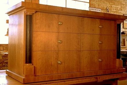
Another project I recently designed was a desk and dresser set that was to have an Asian look.

Asian desk and dresser by Todd Fillingham

The black color was to tie in with other elements of the room. Here you can see the use of another design element common in Asian style furniture, the round leg joined in a bird’s mouth miter with a round rail as well as reference to the cloud rise motif in the bracing rails.

There are many challenges in designing furniture to fit a particular style, especially if the function of the piece needs to be updated. Often traditional designs typical of old or even ancient cultures have elements that are very useful within the broad vernacular the work was being made in and used for. Techniques and tools were passed down for generations. It was made this way because it had always been made this way. Our culture is little different. Think of the common 2 x 4 used in carpentry. My challenge includes using early 21rst century materials and tools as well as the skill set I have acquired in the late 20th century to design and create work that reflects the work of a wide variety of designers and builders from very distinct and different cultures.

I will post shortly about working in the Biedermeier style, a style and method of construction very different from antique Asian furniture.

add to del.icio.us :: Add to Blinkslist :: add to furl :: Digg it :: add to ma.gnolia :: Stumble It! :: add to simpy :: seed the vine :: :: :: TailRank :: post to facebook

…and winter winters on

at-house.jpg

This is four days after the last storm I posted about. This is what’s in front of our house. We’ve had several inches since then with more expected today.

Meanwhile I’m completing the the art nouveau style mirror frame. The last ribbon of wood, fret as I call it, is just about finished.

dsc00391.jpg

This is how it lies into the back of the mirror frame.

dsc00387.jpg

Two other frets, completed and ready to be glued in with the fret patterns.

dsc00385.jpg

As I was milling the tenons on my router set up as an end mill, for some reason the site of this graceful arc of wood clamped to this machine inspired me to take out my camera and shoot today’s shop series.

dsc00386.jpg

The tenons, or end tabs, are initially milled by this end mill.

dsc00390.jpg

I have to finish the joint by hand though. This is because the face being trimmed will have to mate against the inside curved surface of the mirror frame.

dsc00392.jpg

After I have the joints completed I shape the cross section into a gentle, flowing curve. I start by carving bevels that are eventually refined into the final curved section.

dsc00396a.jpg

dsc00397.jpg

This flowing bevel or chamfer reminds me of the path a down hill skier might take or even a surfer flowing across the face of a wave. It’s been a very long time since I did any down hill skiing and from the looks of the snow and ice it will be a while before I do any surfing. Winter!

Surf Board Table III -vii

black-grain.jpg

I tried to get an image that shows how the black dye along with my oil finish brings out the grain in the ash wood used to make the base of the surfboard table. One of the reasons that I dye the wood is to accentuate the grain to create a fluid-like pattern under the top.

Please be sure and take a look at this next posting.

The Design Process: A Table, part 1

I’ve been meaning put up a post that describes the process I go through in designing a simple project such as dining table. This project was completed this fall.

The client contacted me about a dining table for a new kitchen they had recently added. The client, Jackie Boynton, and I discussed the general requirements and set an appointment or me to visit her house so that I could get a sense of the space and other furniture they had.

The table would need to regularly seat 3 and occasionally seat 4. Once I got to the site it appeared that an oval shape top would be appropriate. The new kitchen was contemporary enough, with large windows and clean woodwork for an oval to work, the space was somewhat small for a rectangle and we did not want to constrict the traffic flow of a busy kitchen, used for cooking, homework, family gathering and many other activities.

I eventually established a comfortable table size by taking measurements of the site, modeling the site in my 3D cad program and by using my “ergo man” model. This is a model I’ve created to allow me to assure enough room for table settings as well as many other ergonomic design concerns in many projects. Here’s a screen shot of this model:

ergo-man.jpg

Here’s an image I took while on site of the area the table would eventually occupy.p6050001.jpg

You can see the old table, obviously too small.

I manipulated this image in my photo editing application and added a rendering of an early sketch idea for a table to get a sense of the style direction I should be going towards.

adjusted.jpg

This process of manipulating the image in a photo editing program is awkward and doesn’t allow me to measure the clearance around the table and to get a good idea of how the table will look so I modeled the space in the 3D cad program and was able to drop in various rough ideas for table designs.

To get a dialog going betwenn Jackie and myself about the table design I created a series of 3D sketches and quickly rendered them and was able to email them to her and her husband, Peter. They were able to discuss them and get back to me. Here’s a link to my Flickr set showing several of these sketches:

byntn-sktch-thmb.jpg

I think that these designs have a lot of potential and look forward to interesting another client into having me finish one or more of them.

In part 2 I’ll show the two finalists that Jackie and Peter chose, the eventual final choice and the completed table.

Bid process

I’m working on a bid and design for a small project today. A client called and asked about toy storage and book cases. After a site visit to discuss the project, get dimensions and take a few pictures I generated a quick study in the form of block studies of the proposed pieces. I want to be sure that the client and I are thinking of the same thing before I start working out the details and a bid price.

Here’s one of the views .

toy-storage.jpg I use Rhinocerous nurbs modeling for Windows to create the models and Flamingo for rendering.

I understand that the budget will be tight for this project so I’m thinking of building the cases out of baltic birch plywood. You can simply round over the edges and sand them smooth with out having to add solid edging. This not only is nice looking but saves time.

Here’s a stand up desk I recently made with a top that was made from baltic birch plywood. The edge detail isn’t really clear. but you can get an idea of what I’m talking about from this shot.

Stand up desk by Todd Fillingham.

Surf Board Table

In searching and reviewing all the images on my hard disk yesterday to find the ones I want to put up on my web site I remembered this great coffee table I designed and made for a fellow surfer. This was something I wanted to be sure and show. Unfortunately I could not find it on my computer. Eventually I started looking in various CDs I’d burned and finally found it in a zip archive. Actually, the file I found was the Rhino file I’d created to do the design work. After all that searching I though I might as well put it up on my blog today as it will still be sometime before I can show it on a new web site.

Rhino let’s me create simple line drawings like this:Urf Board Table by Todd Fillingham

as well as renderings using Flamingo. Here’s a rendering that I created then used Paint Shop Pro to reduce the number of colors used to slim down the file size. By doing that it made a nice ring pattern reminiscent of water on the floor.

Surf Board Table rendering by Todd Fillingham.

In designing a surf board coffee table I wanted to express some sense of the curve of a wave under the table top. I chose to abstract that curve and make use of the negative space around the structure to give some dynamism to the design. The curved space varies as you change your view point.

This is a good example of a design that really has to have several jigs to accomplish the joinery. Now that I have worked them out and have saved my construction notes I hope to sell a few more. The price for this table would start at $1,000. The price will vary depending on the wood species used.

I would love any feedback on this design.

Todd

Fillingham Art Furniture Design


part 2 is here