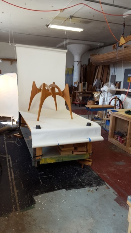
Over the years I’ve made many stools inspired by the stools Wharton Esherick made. Above is one of my latest.

I keep a copy of a clipping on the wall of my studio that I clipped from a magazine long ago. It shows an artist’s studio with at least 3 Esherick stools. Maybe the stools were inspiration, I’m sure they were functional. I have used several of my stools both in my home and in my studio. They’re great. They are light weight, sculptural, comfortable, and get better with age (natural daily polishing of the seat).
 Here’s a stool I made many years ago. It was sold through a gallery I was showing in at the time. I like the way I did the rungs. The legs on this stool are square in section. My new stools have lathe turned legs and rungs. I’m thinking of doing a stool soon though that has both turned legs and sculpted rungs.
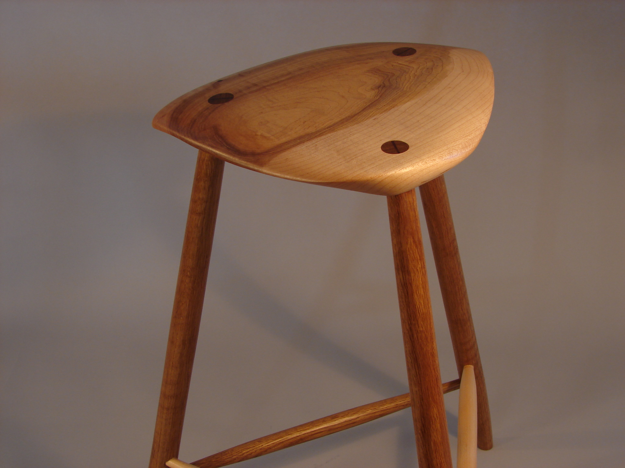
 Above is another view of one of two stools I’ve just finished. This stool’s seat was carved from a gorgeous piece of walnut that was sawn from the crotch of a walnut tree. The grain is extraordinary.


I cut the seat to best highlight the grain pattern.
The second stool I just completed does not have as striking a grain pattern nevertheless it is a very nice looking stool.

A couple of angles are needed to get an idea of what this stool looks like.

 Wharton Eshericks stools command a lot of money these days.
Live Auctioneers have one listed at an estimated price of $4,000 – $6,000 with the bids starting at $2,000. Architonic, Sotheby’s, and Rago list similar prices.
The Museum of Arts and Design shows a very nice Esherick stool online as well.
Of course these prices are high because of Wharton Esherick’s name and reputation, and (unfortunately) because he is dead.
I am selling these stools on Etsy at a fraction of the prices listed above (…LOL…). I also have two more stools in the works and will list them on Etsy as soon as they are done.
Are these stools art? They are sculptural, but are they sculpture? I think of them as art furniture. They fall close enough to sculpture on the art- craft continuum for me to sometimes shorten “art furniture” to just “art” because in making them I am expressing a feeling and emotional vision in an abstract way. There is no question that they are functional however, functional beyond the true, fundamental function of art.
If you take a little time to contemplate some of the elements and forms that these stools are made of you may notice a few things. One is that the shape of the legs are different for the 2 stools. This shape shifts a sense of motion (or stability) by adding mass either towards the floor or upward. Another thing you may notice is the angles of the rungs and the space that is outlined by the legs, seat and rungs as you move around the piece. These things are subtle and take time to appreciate, but are some of the elements that I considered when making them
Here’s a link to my Etsy store if you would like to consider owning one (or both!) of these stools.

UPDATE: I just got word of this show: Wharton Esherick: Birth of the American Modern . It looks very interesting.
UPDATE 2: These stools have been sold. I am working on several more as we speak though.
I keep a clipping on the wall of my studio